With the end of 2016, the official reign of last year’s Color(s) of the Year -Rose Quartz and Serenity- has come to an end. In its place, the experts at Pantone Color Institute named its 2017 Color of the Year, Greenery (aka Pantone 15-0343). Described as a “fresh and zesty yellow-green shade”, the mesmerizing hue has already made appearances on fashion runways and home decor, playing the chameleon so well that its versatility cannot be overstated. Leatrice Eiseman, executive director of Pantone, explains to the New York Times that, “[Greenery] is the color of hopefulness....", and was chosen for its evocation towards fresh starts and new beginnings. In keeping with the new year's promise for a clean slate, we can't think of a better color than greenery to re-energize your home's style in 2017. See how we're incorporating the fresh hue in every room.
Wade into the greenery trend by giving your bathroom a fresh facelift in 2017. A ceramic tile with a pretty pattern can create a sense of luxury, delivering a spa-like ambiance in an everyday space. We like Pantone’s Color of the Year mixed in alongside complementary shades of turquoise and ultramarine for a dynamic look that evokes a clean, harmonious atmosphere. Finish the look with accent stools upholstered in the verdant color, with touches of peach and gilded accents that warm up the space.
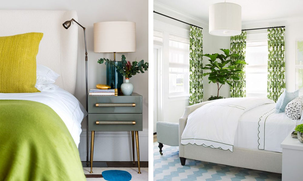
A touch of green offers an unexpected, contemporary edge that feels especially unique in a bedroom setting. Vibrant greenery, by way of bedroom linens and textiles, can wake a bland bedroom into a bold and beautiful refreshing retreat. Whether you decide to add a pop of color to your bed with a throw or with window treatments on your windows, remember that this dynamic color is incredibly adaptable, especially juxtaposed against muted tones like ivory or steel blue.
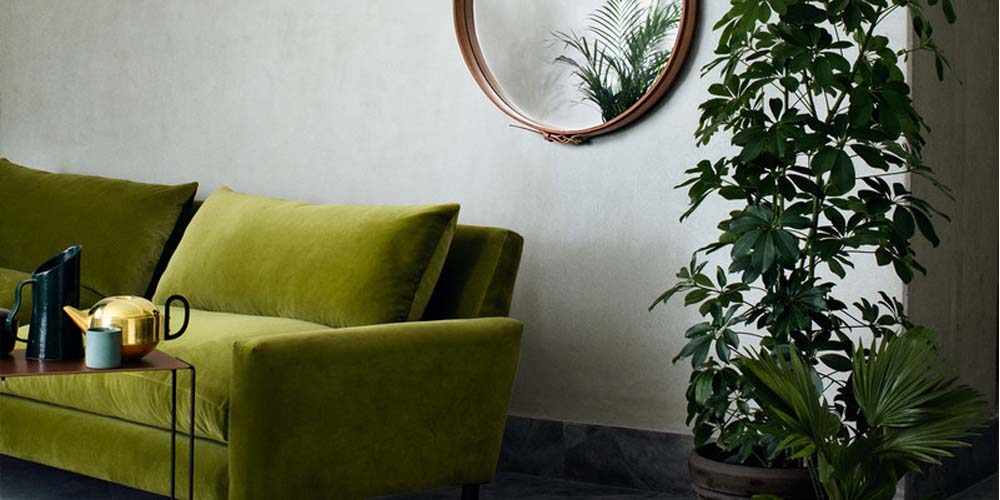
Greenery is a fashion-forward choice, yet can act as a neutral when applied to seating in the living room. To create a sense of flow throughout your home with this of-the-moment color, choose shades that carry the same tonal weight. Pair greenery with its chromatic opposite. Vivid hues of magenta and grape lend a sense of adventure and whimsy that perfectly complements Pantone’s Color of the Year. It’s an especially striking combination in this living room, with a lush velvet sofa matched against an ikat-print accent chair.
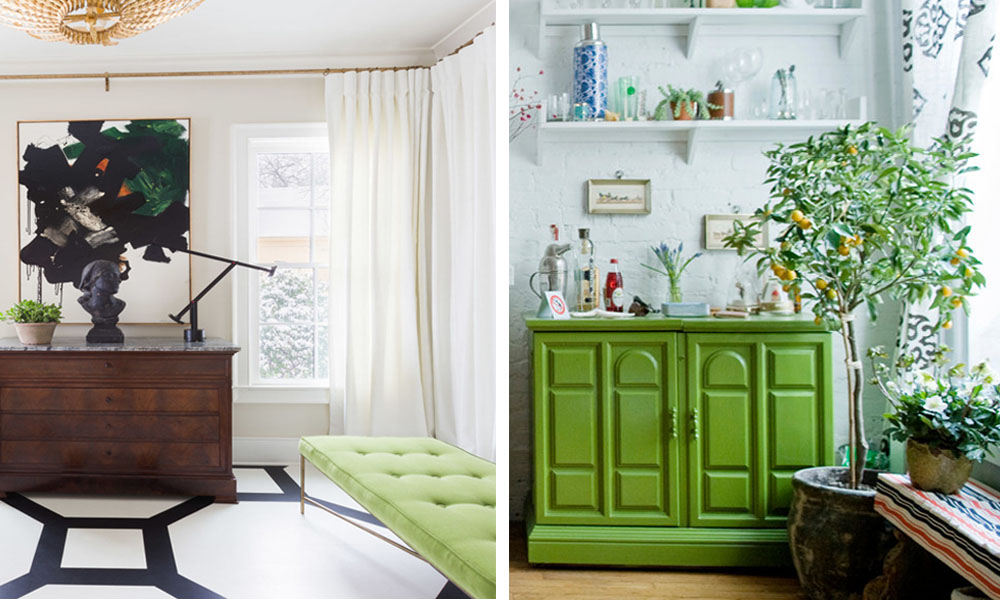
Greenery is a vibrant shade that, with a little bit of finesse, is easier to incorporate into one's home than one might expect. Accent furniture, such as an upholstered bench or a chest of dresser drawers, gets a stylish refresh when dressed up in the exciting color, breathing new life into neglected spaces. When looking for a little home rejuvenation, look no further than statement furniture in this leafy shade to brighten corners and hallways in a daring way.
For a charming take on preppy style, the Pantone Color of the Year adds playful sophistication to graphic and geometric black-and-white prints. The crisp combination of colors and patterns is an exuberant approach to interior design, lending depth to a warm and inviting aesthetic. When applied in a colorful rug, the effect is approachable, for a polished abode with plenty of allure.
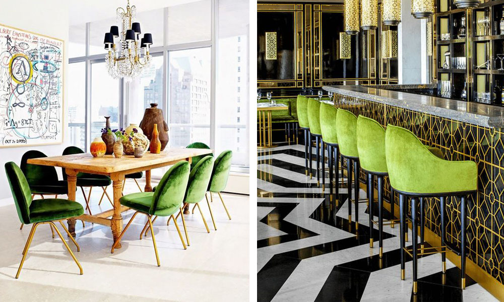
Introducing spirited dining chairs clad in sumptuous green velvet adds unparalleled glamour to any dining space. The splash of color is an invigorating choice that look fresh against lavish Art Deco styles or eclectic decor. Greenery plays well with any style, bringing in nature’s neutral in bold and exciting ways. When paired with brass accents, greenery conveys a sense of refinement that lends elegant flair to any space.
A farmhouse kitchen with plenty of rustic charm gets a bold update with the addition of big and bold pendant lighting. The playful color is the perfect choice to punctuate the tone of existing home decor, adding exuberance and drama to reclaimed vintage furnishings.
For more inspiration, check out LuxeDecor's Design Ideas for curated, home-ready styles.
(Article by Christine Villanueva)